FORGING A NATION
STORIES OF CONFLICT, RESILIENCE, AND IDENTITY
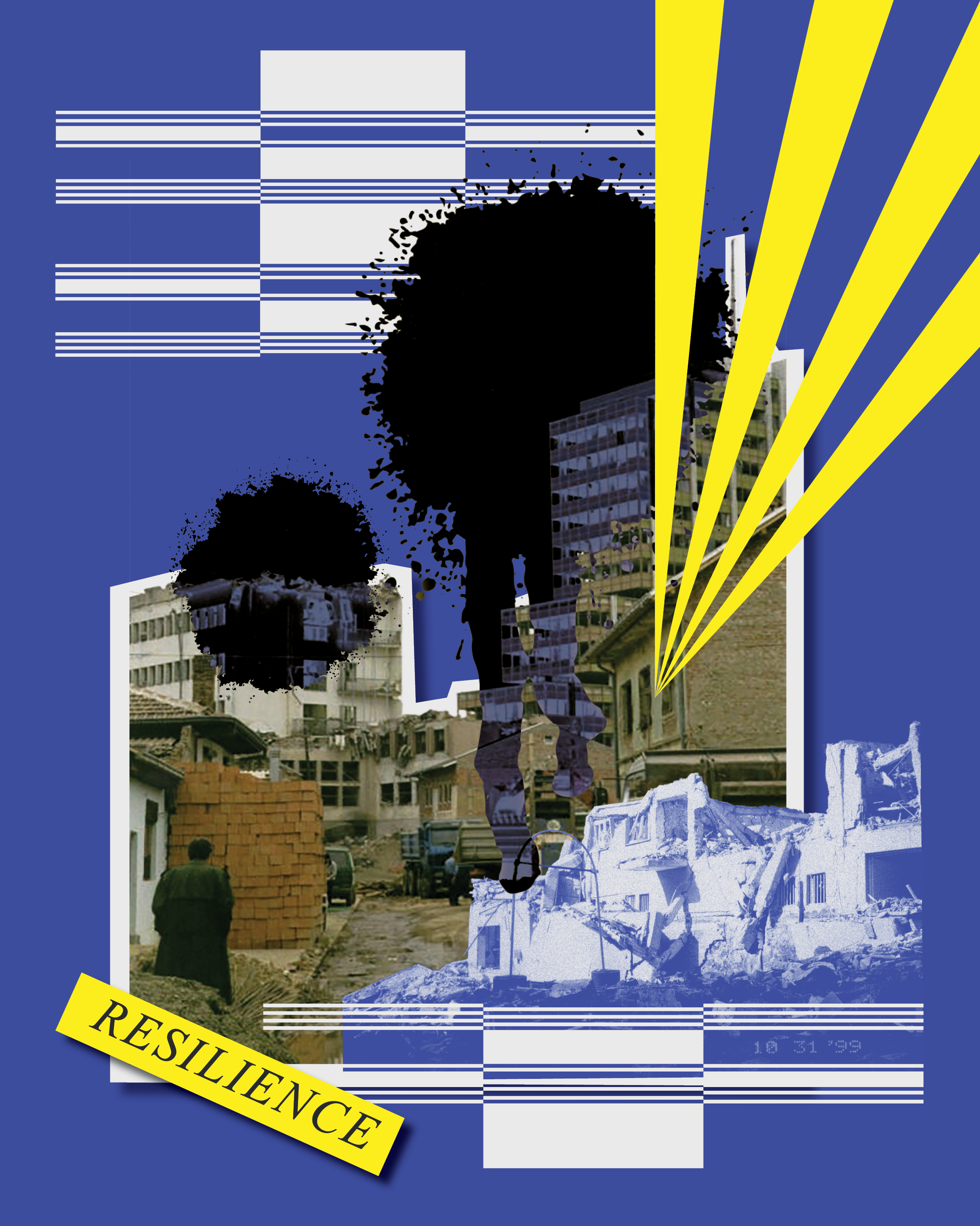
Designed and produced an immersive storytelling exhibition exploring the lived experiences of young adults in Prishtina, Kosovo.
As a recipient of the Lumos Travel Award, I developed a multi-sensory narrative environment that integrated interviews, photography, video, and interactive media to examine themes of post-conflict identity, generational resilience, and national rebuilding.
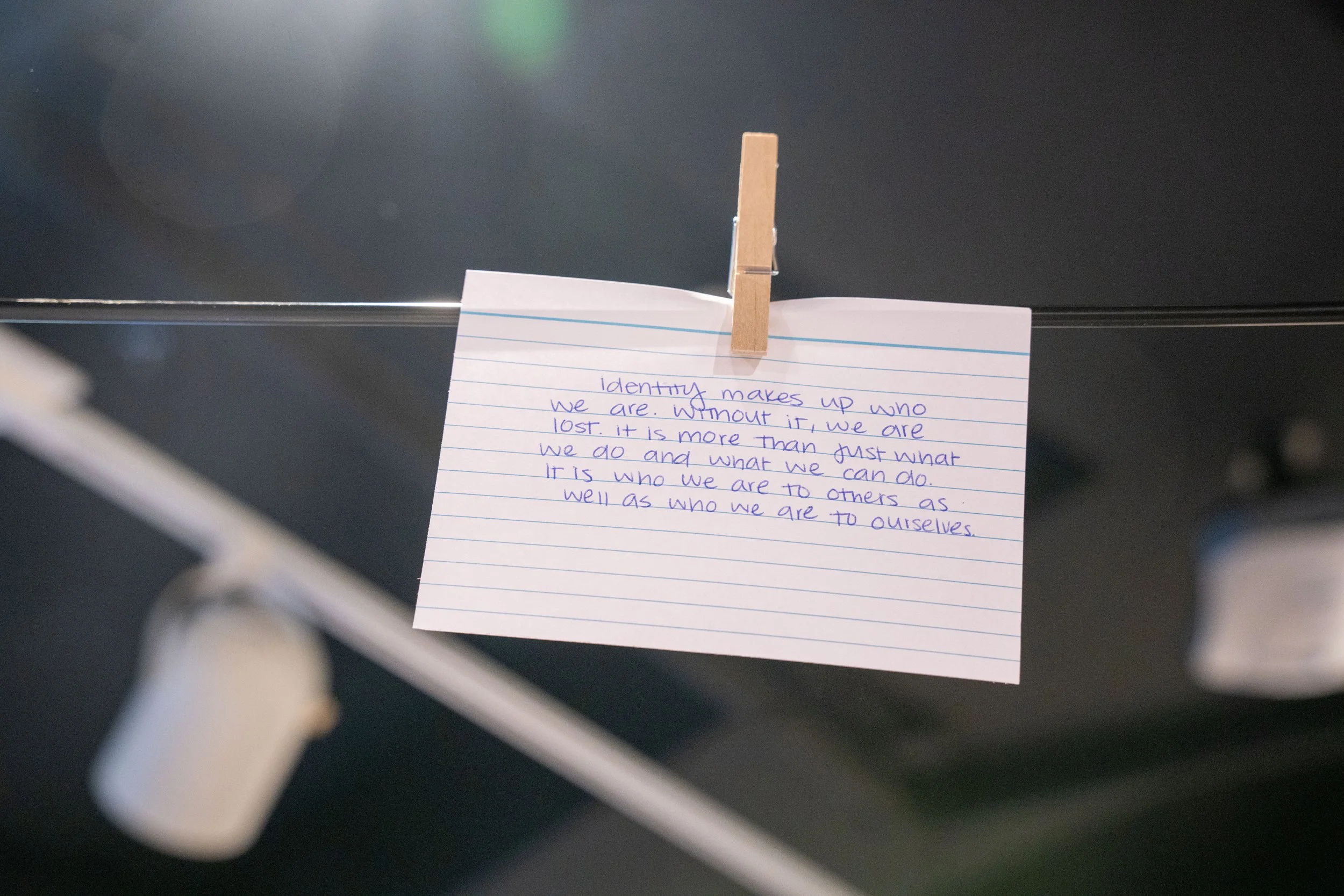
“We built, and we tried, and we learned. I think if you think about the fact that only 25 years ago this place was burnt to the ground and destroyed, and if you come to see what it is now, you don’t need to talk about the progress, it’s right there, it’s in your face, you see it.”
- Lirie Ibrahimi
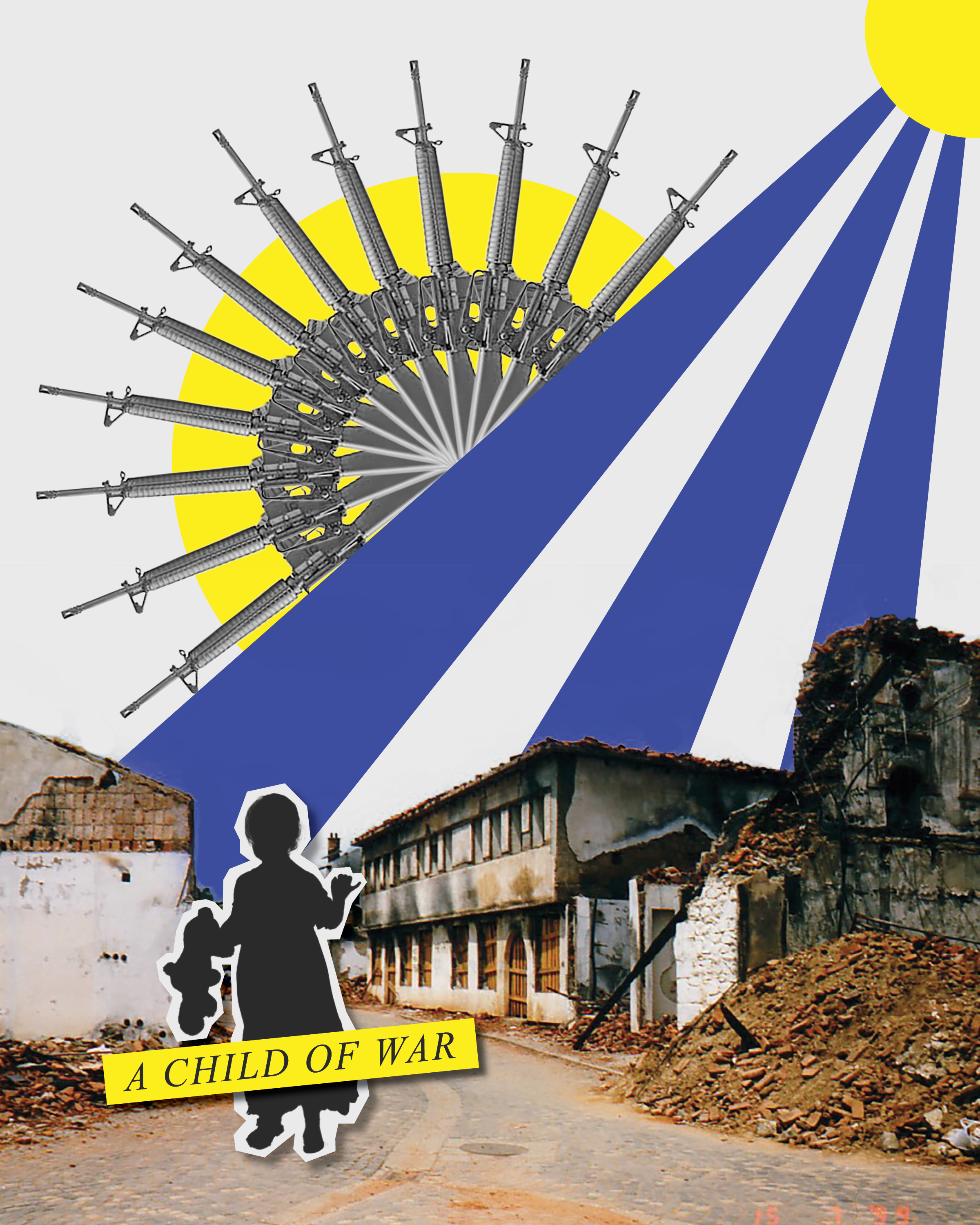
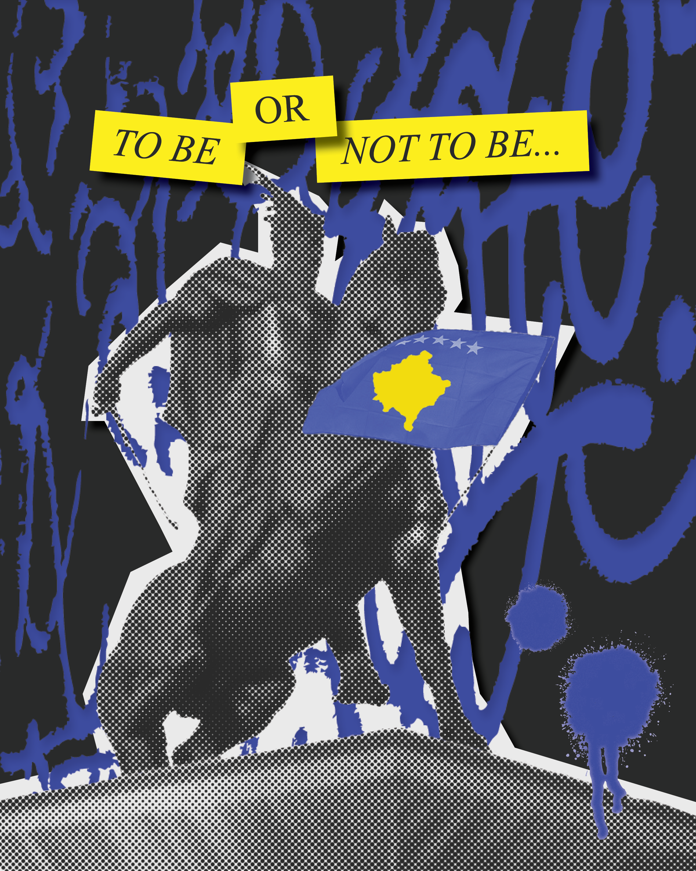
Kosovo is Europe’s youngest country in both independence and population. Declaring independence in 2008, 65% of the country’s population is currently below the age of 35. The country’s recent history of war, rapid reconstruction, and ongoing nation-building creates a generational landscape uniquely shaped by both memory and momentum.
This demographic and political context presented a unique opportunity to explore themes of identity formation, resilience, and future-oriented thinking through the voices of young adults in Prishtina.
Interactive Touchpoints
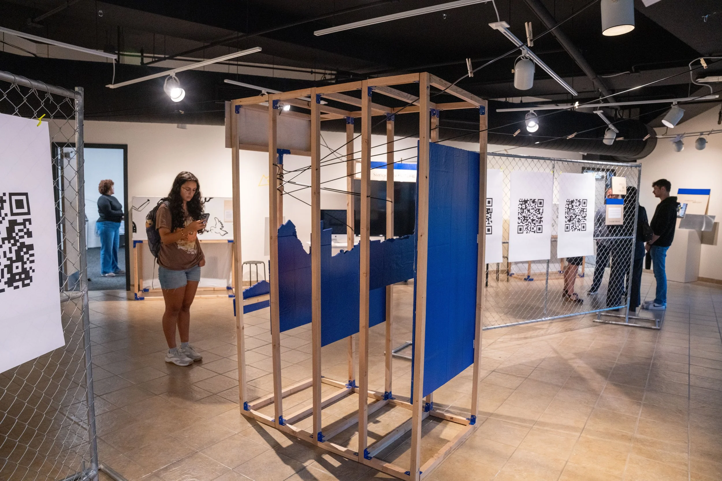
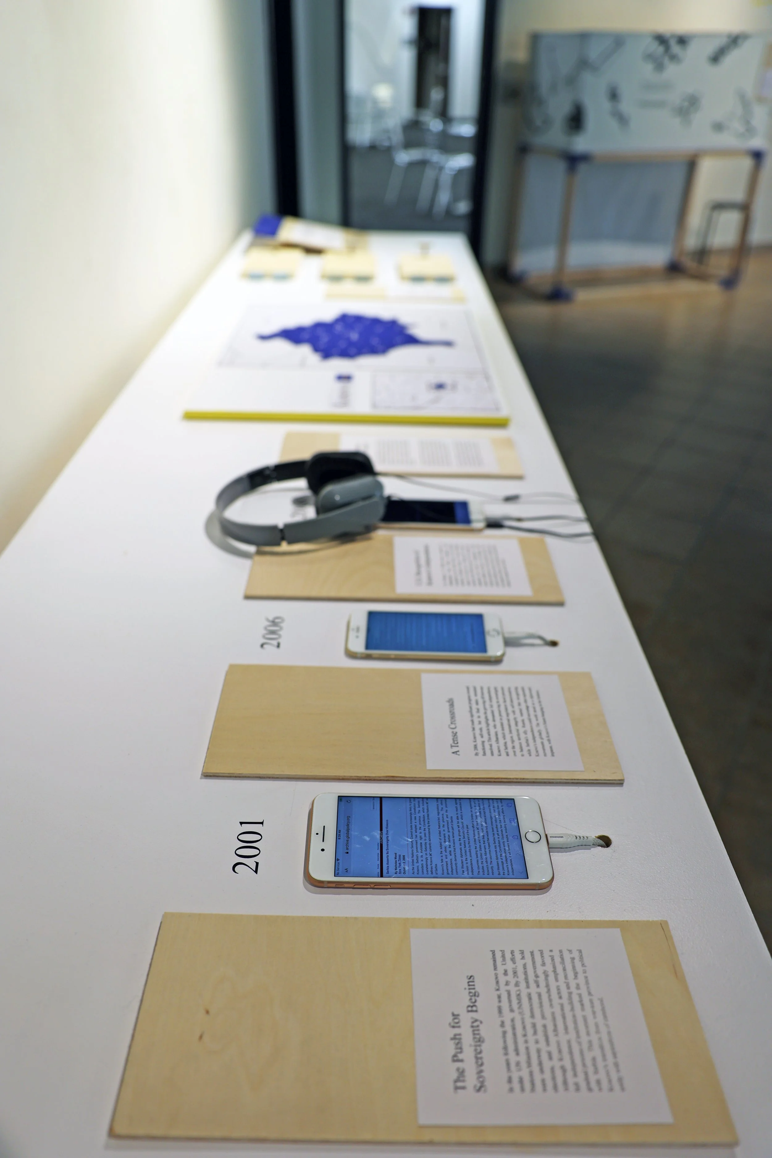
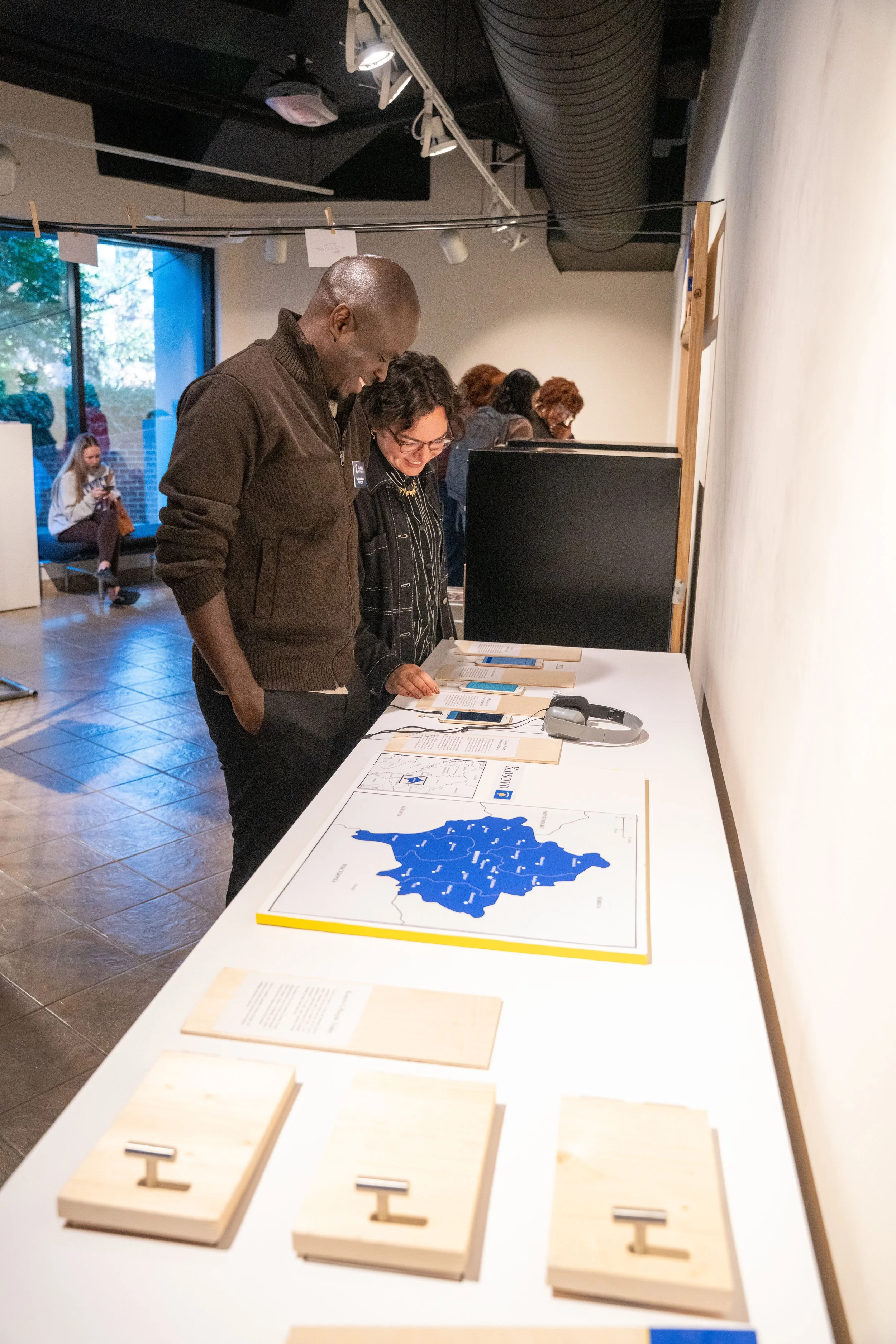
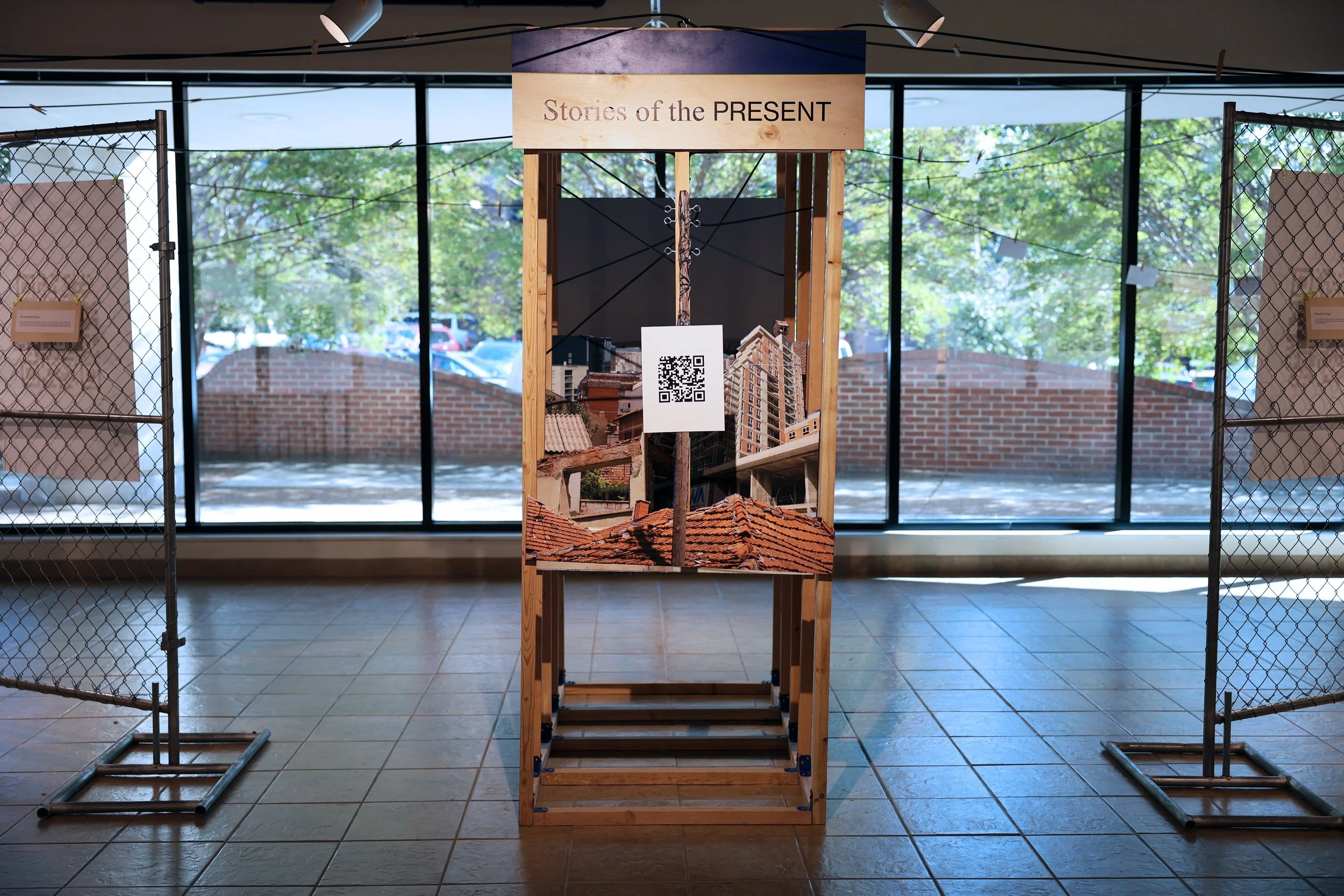
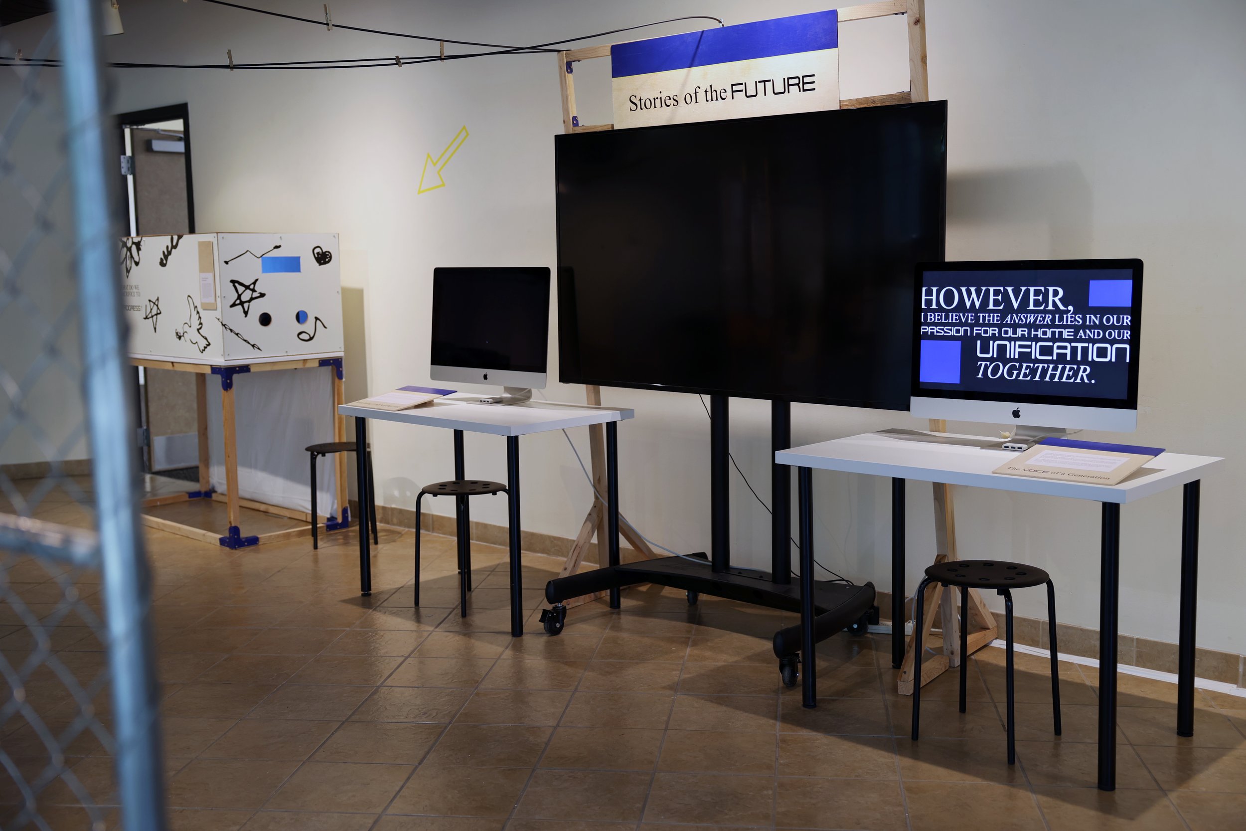
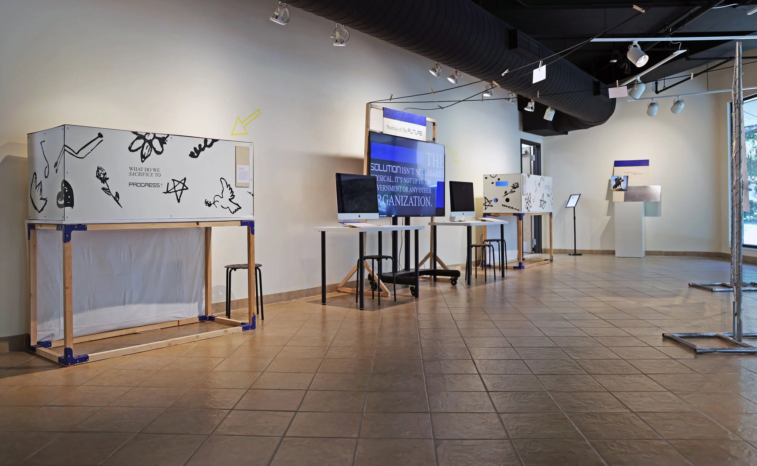
To immerse visitors in Kosovo’s evolving narrative, the exhibition integrates interactive media spanning past, present, and future technologies.
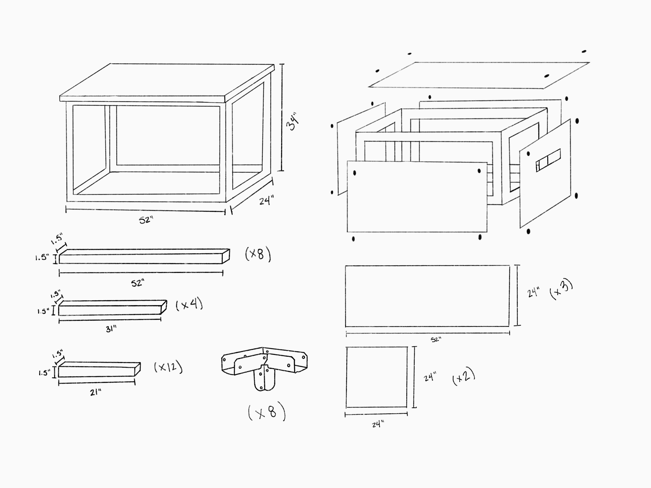
Archival touchpoints, including maps, newspapers, filing cabinets, and CD players, ground visitors in the country’s complex historical context through tactile engagement.
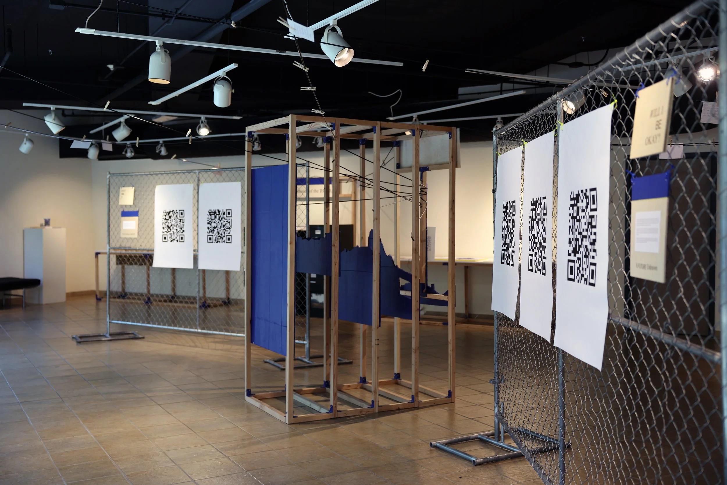
QR-based interactions prompt guests to use their personal devices to explore the perspectives of those who call Kosovo home and extend the dialogue beyond the gallery space.
Projection mapping and motion graphics visualize how high school students in Kosovo imagine their future, transforming the environment into a forward-looking storytelling experience.
Translating research themes into a design system.
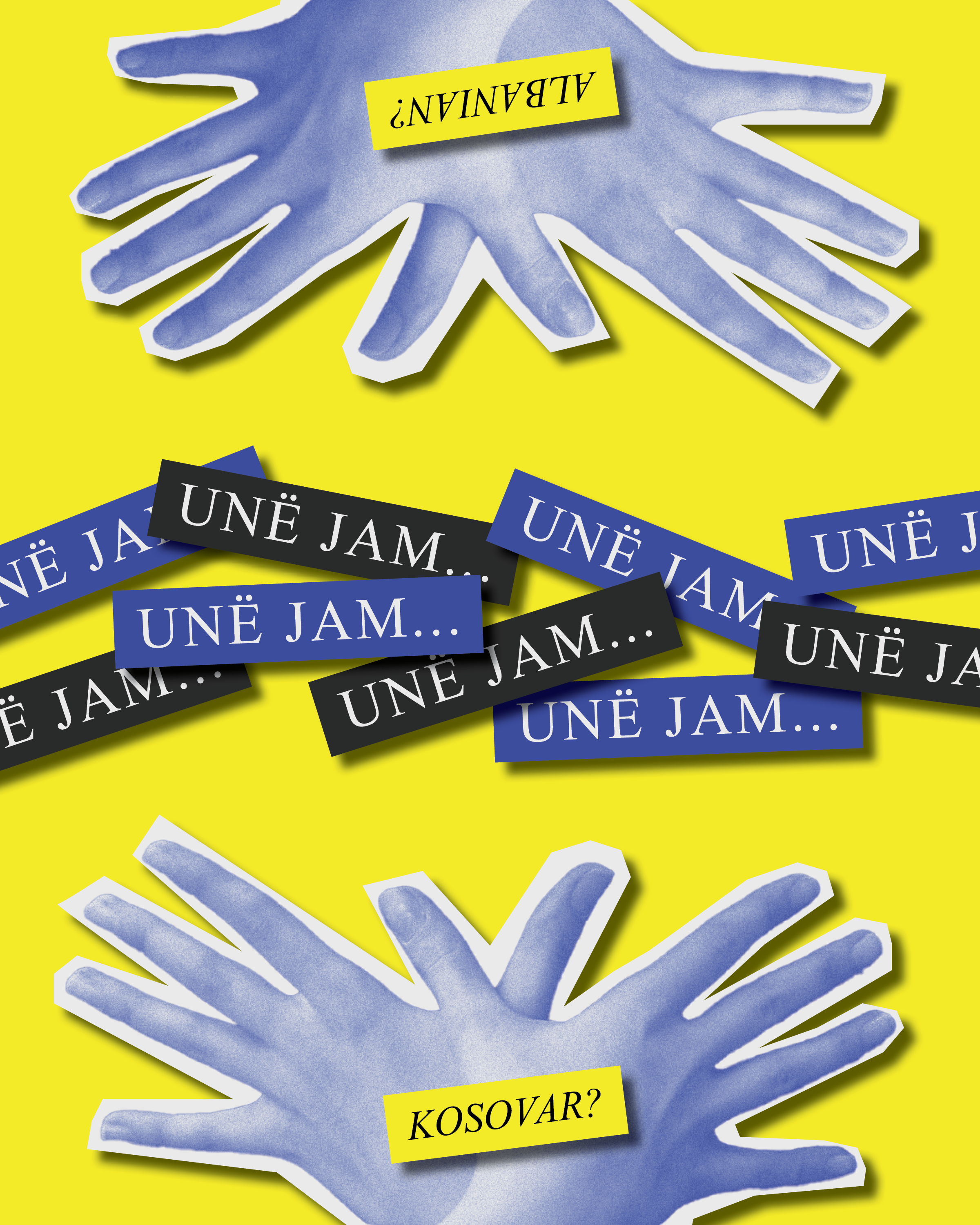
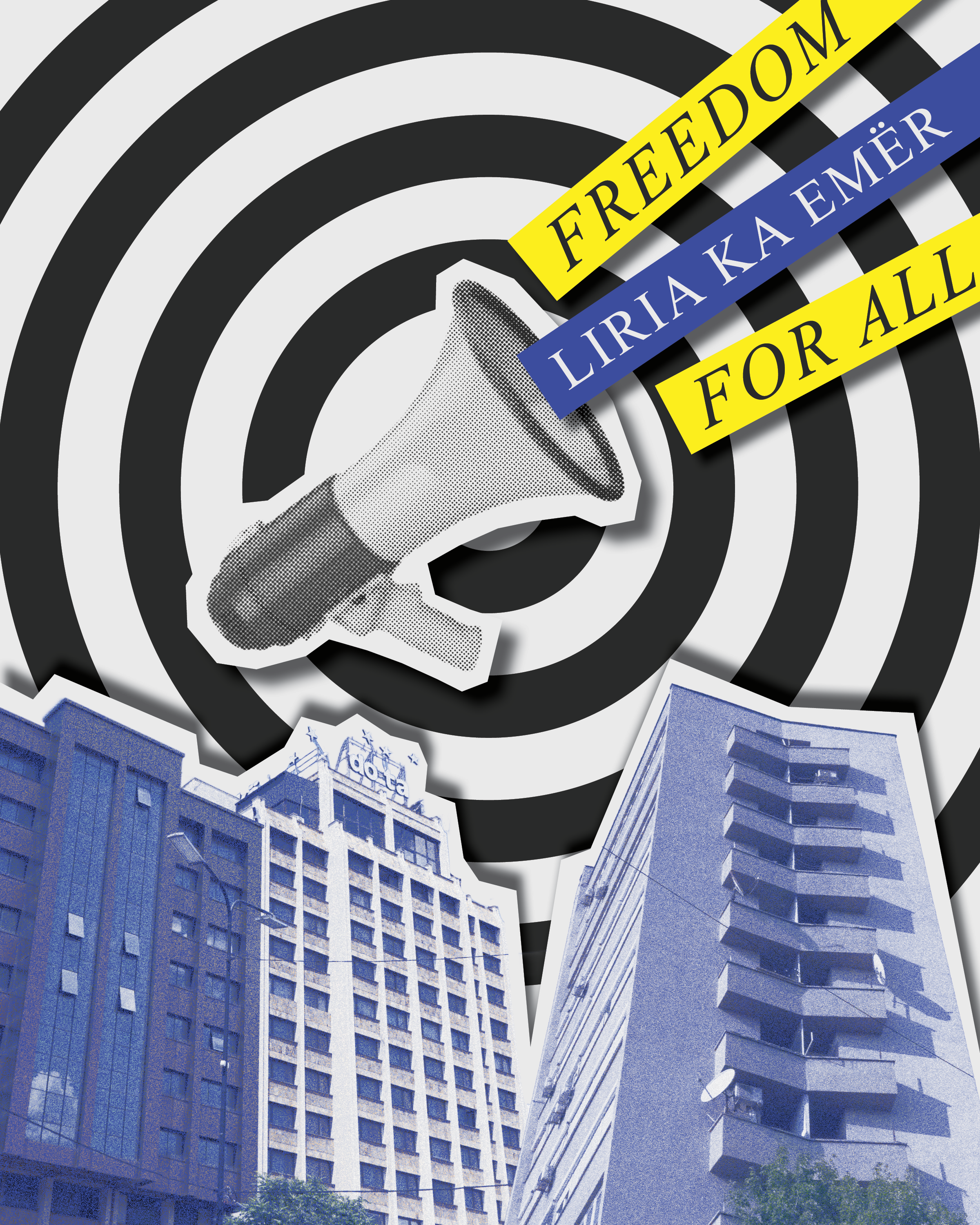
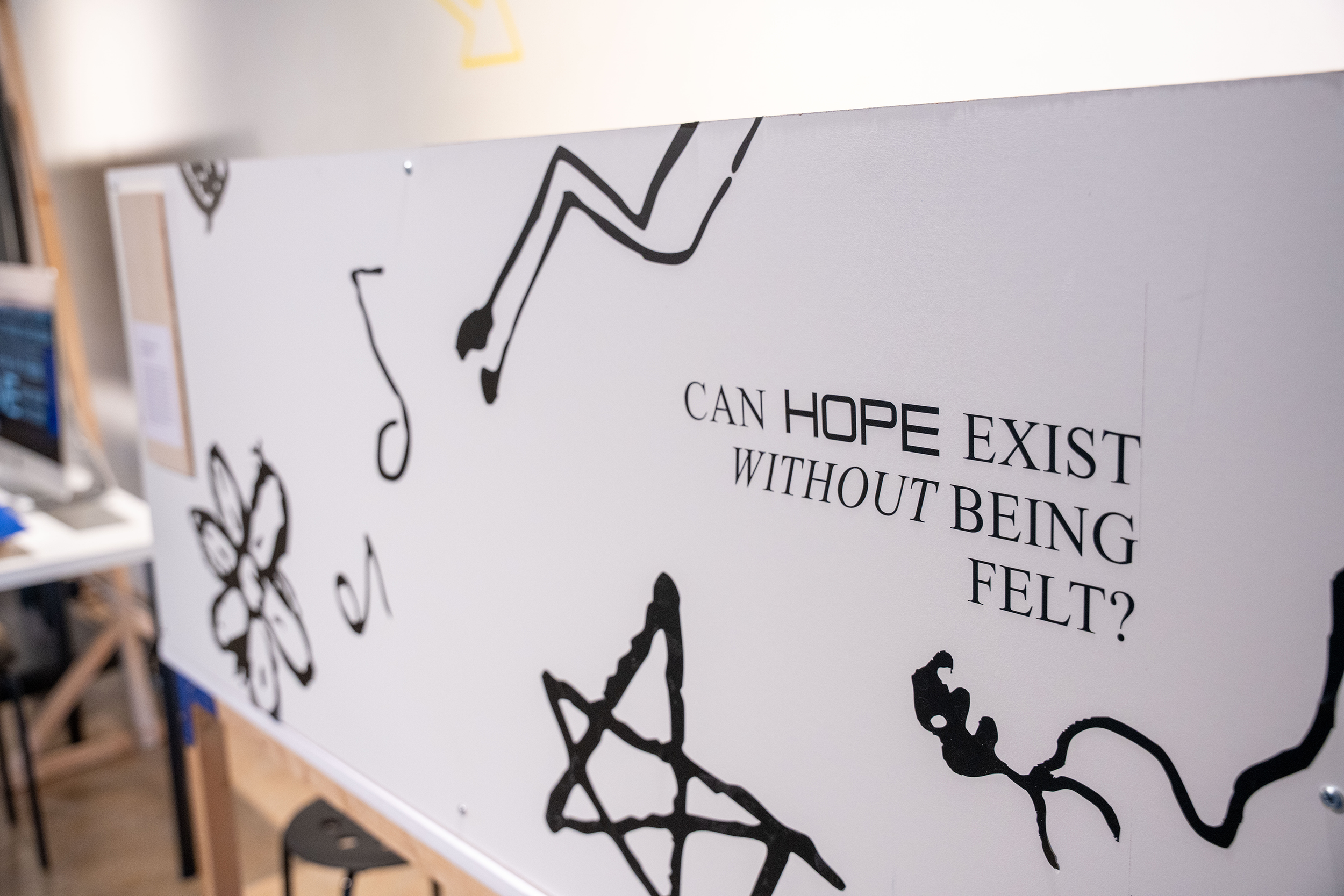
Young Kosovo Albanians are in a unique position between the weight of the past and the unknowns of the future. The pull between tradition and innovation, as suggested by my research, is translated into the environment through contrasting typography, color, and material selection.
Times New Roman
Serving as the typographic anchor, Times New Roman establishes a clear narrative foundation and reflects the exhibition’s documentary tone. Its familiarity and neutrality provide visual balance and contrast to the evolving accent typefaces across each section.
Courier
Courier was utilized for titling and environmental graphics within “Stories of the Past,” referencing analogue technologies and early mechanical communication. The tactile quality reinforces the historical context of the section.
Neue Haas Grotesk
Selected for its modern clarity and digital familiarity, Neue Haas Grotesk reflects the immediacy of smartphone communication and the interconnected nature of the present.
Tenby Eight
Tenby Eight introduces a coding-inspired aesthetic that reflects digital innovation and the forward-thinking perspectives shaping the “Stories of the Future” section.
Balancing a high saturation color palette with neutral materials.
The color palette draws from the national flag to maintain cultural recognition while using vibrant, saturated tones to reflect the energy and forward-looking perspective of young adults.
Spatial Experience Strategy
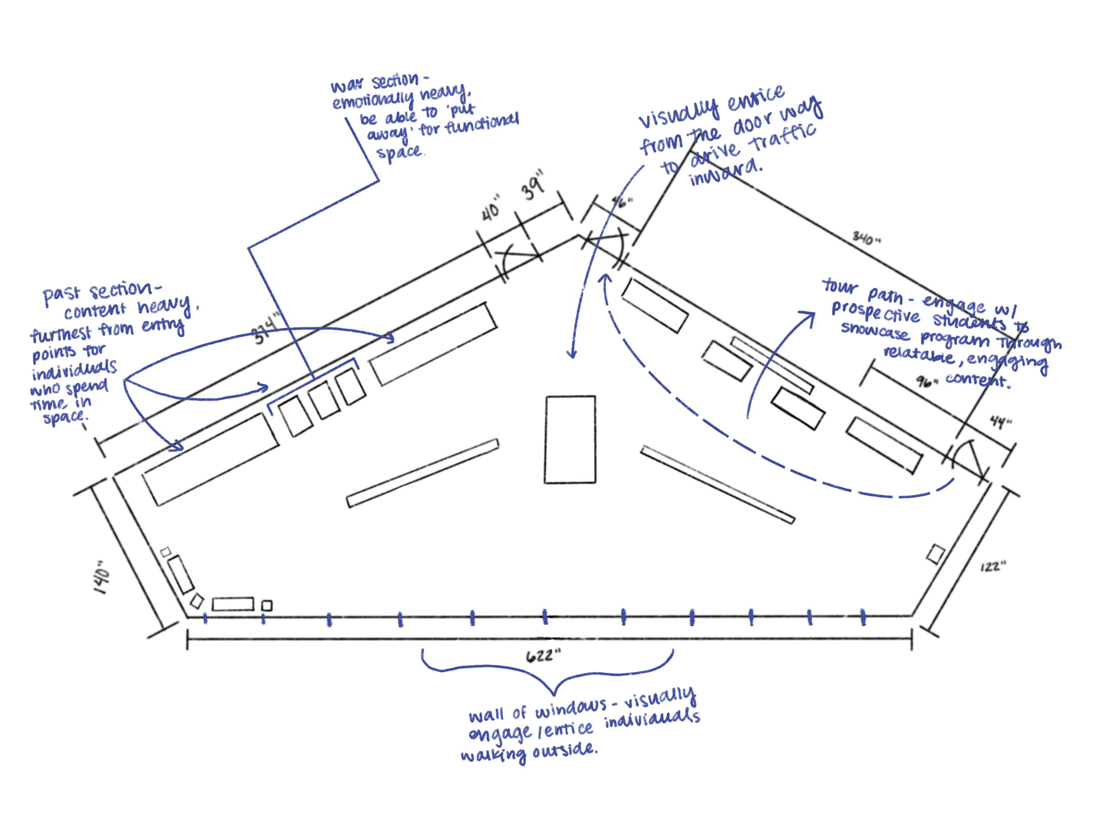
Through the analysis of user needs, pain points, and opportunities, the exhibition is spatially designed to maximize engagement in areas with the greatest impact. The exhibition layout is intentionally structured to be functional, engaging, and to spark curiosity.
Who are the exhibition visitors?
Courtney, a student at Watkins College of Art, is a frequent visitor to the gallery space. She goes in there to pick up a call during class, department events, or to kill time between classes.
Travis, a young artist in the Metro Nashville area, is an alumnus of Belmont University and stays up to date on local gallery exhibitions in the area.
Avery and their parents are touring Watkins College of Art and Belmont University as a prospective student. They are interested in an art program but are not sure what major to choose.
